10 Simple Steps to Create a Pivot Chart in Excel

Pivot charts in Excel are dynamic and interactive tools that transform your raw data into insightful visuals. They allow you to summarize, analyze, and present complex datasets with ease, making it simpler to identify trends, patterns, and outliers. This step-by-step guide will walk you through the process of creating a pivot chart in Excel, empowering you to unlock the full potential of your data.
Why Use Pivot Charts?
- Interactive Exploration: Drill down into specific data points and explore different perspectives.
- Customizable Views: Tailor your chart to focus on specific metrics and dimensions.
- Dynamic Updates: Automatically refresh your chart as your source data changes.
- Data-Driven Decisions: Gain valuable insights to inform your decision-making process.
10 Steps to Create a Pivot Chart in Excel
-
Prepare Your Data: Ensure your data is organized in a tabular format with clear headers.
-
Insert PivotTable: Click anywhere within your data range, go to the “Insert” tab, and click “PivotTable.”
-
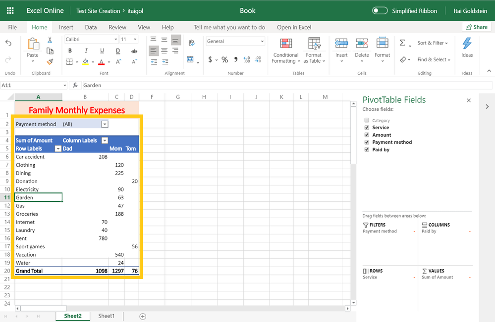
Choose Location: Select where you want to place your PivotTable (new worksheet or existing one).
-
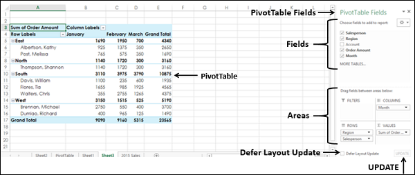
PivotTable Fields: Drag and drop fields from the “PivotTable Fields” pane to the “Rows,” “Columns,” “Values,” and “Filters” areas.
-
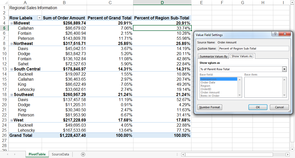
Summarize Values: Choose how you want to summarize your data in the “Values” area (sum, count, average, etc.).
-
Insert PivotChart: With the PivotTable selected, go to the “Insert” tab and click “PivotChart.”
-
Choose Chart Type: Select the type of chart that best represents your data (column, bar, line, pie, etc.).
-
Customize Your Chart: Modify the chart’s appearance, add titles, labels, and legends.
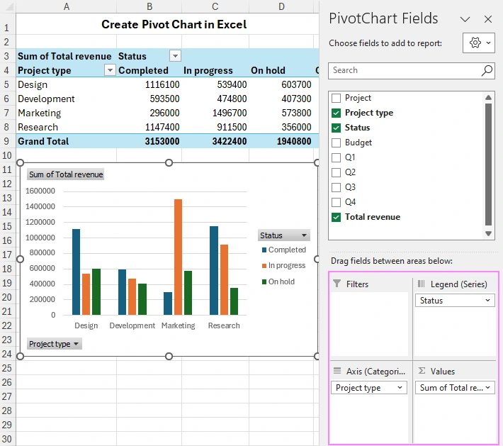
-
Interact with Your Chart: Click on different elements of the chart to drill down into specific data points.
-
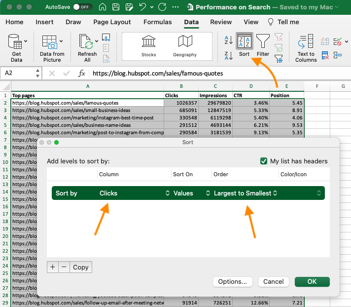
Filter and Sort: Use the “Filters” area to filter your data and the “Sort” options to arrange it.
Tips and Tricks
- Calculated Fields: Create custom calculations based on your data.
- Slicers: Add interactive filters to your chart for easy data exploration.
- Timelines: Visualize time-based data with interactive timelines.
- Conditional Formatting: Highlight specific data points based on conditions.
- Chart Templates: Save your customized chart as a template for future use.
Conclusion
Pivot charts are invaluable tools for data analysis and visualization in Excel. By following these 10 steps and exploring the additional tips and tricks, you can create compelling pivot charts that unlock the hidden insights within your data. Whether you’re a business analyst, marketer, or simply someone looking to understand their data better, pivot charts can empower you to make informed decisions and drive meaningful results.

