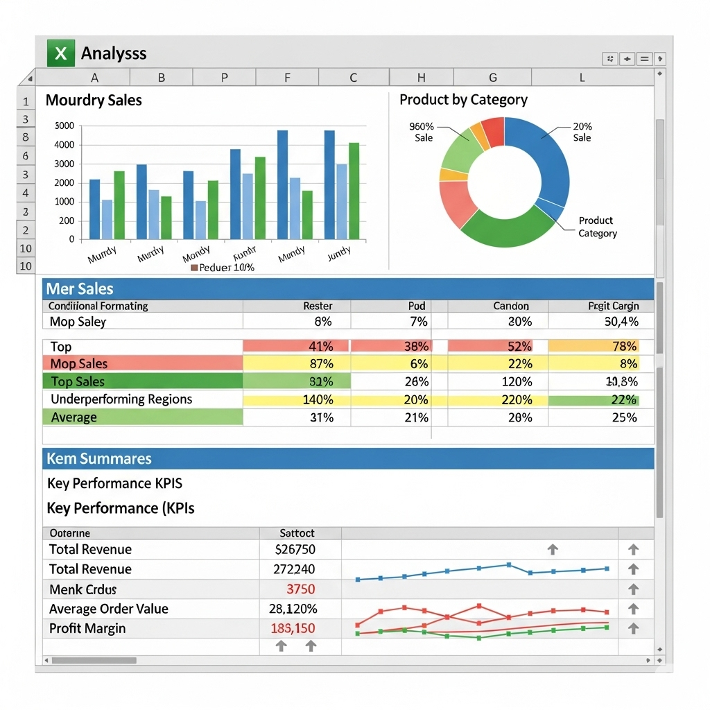
Excel Quick Analysis Tool: Simplify Your Data Analysis with Ease
Microsoft Excel is one of the most powerful tools for data management and analysis, but not every user is aware of all its hidden features. One such underrated gem is the Quick Analysis Tool—a built-in feature that helps you analyze data instantly without manually applying formulas, charts, or formatting. Whether you’re a beginner or an experienced Excel user, the Quick Analysis Tool can save you time and make your workflow more efficient.
This guide will cover what the Quick Analysis Tool is, how to use it, and how it can transform your data analysis process.

What Is the Excel Quick Analysis Tool?
The Quick Analysis Tool in Excel provides a fast way to apply common data analysis tasks to a selected range of data. Instead of manually navigating through multiple menus, you can instantly access:
-
Conditional formatting
-
Chart creation
-
Totals and calculations
-
Tables
-
Sparklines
It appears as soon as you select a range of data, showing a small icon at the bottom-right corner of the selection.
Why Use the Quick Analysis Tool?
The Quick Analysis Tool simplifies complex tasks by offering one-click access to Excel’s most popular features. It’s perfect for:
-
Beginners who want guided analysis options.
-
Time-conscious users who need quick results.
-
Data-driven decision makers who want to visualize patterns instantly.
It helps reduce errors, speeds up repetitive tasks, and encourages experimentation with Excel’s advanced tools without needing deep technical knowledge.

How to Access the Quick Analysis Tool
Using the Quick Analysis Tool is straightforward:
-
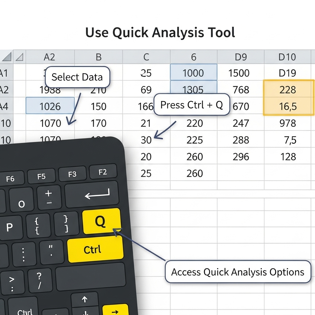
Select Your Data
Highlight the range of cells containing the data you want to analyze. -
Look for the Quick Analysis Icon
Once selected, a small icon appears at the bottom-right corner of your selection. -
Click the Icon
This opens a menu with different categories: Formatting, Charts, Totals, Tables, and Sparklines.
You can also access it by pressing Ctrl + Q after selecting your data.
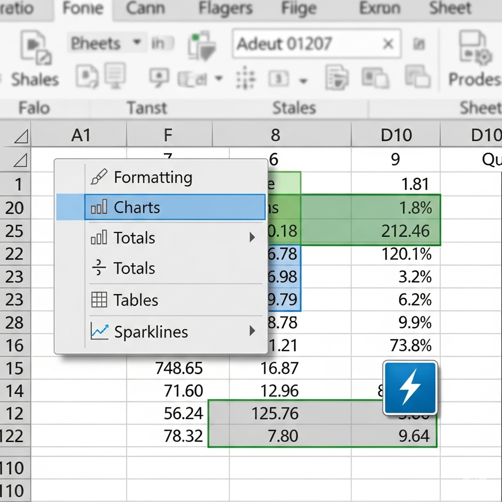
Categories in the Quick Analysis Tool
The Quick Analysis Tool is divided into five main categories, each with unique functions.
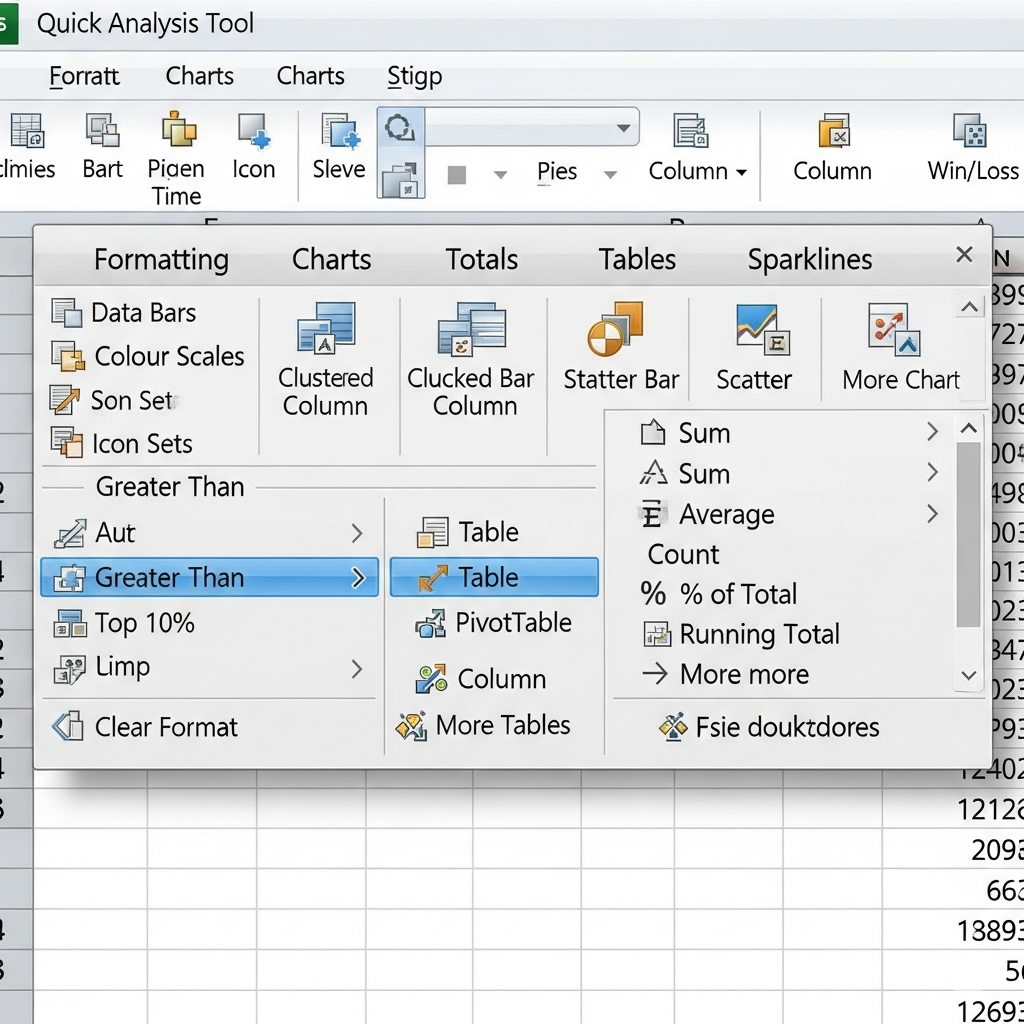
1. Formatting
Formatting helps highlight important data patterns. Common options include:
-
Data Bars – Add horizontal bars inside cells to represent values visually.
-
Color Scales – Apply gradient colors based on cell values.
-
Icon Sets – Display icons (arrows, flags, etc.) to indicate trends or thresholds.
Example: Use a color scale to identify the highest and lowest sales figures in a dataset instantly.
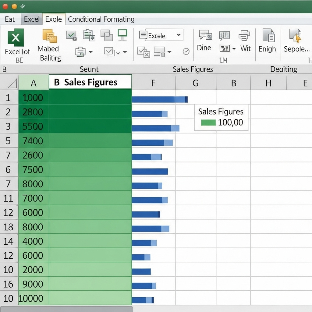
2. Charts
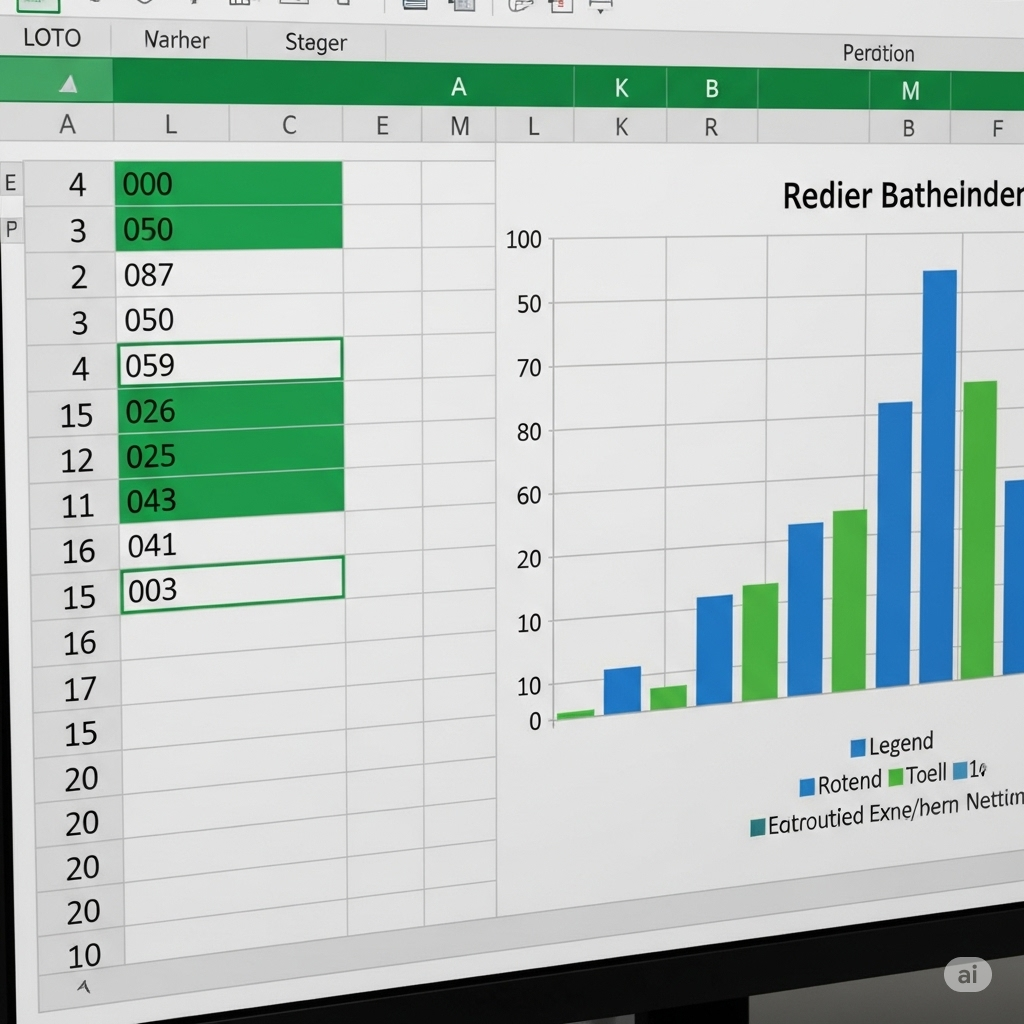
Charts are essential for visualizing trends and patterns. The Quick Analysis Tool offers recommended chart types based on your data, such as:
-
Column charts
-
Line charts
-
Pie charts
-
Bar charts
Excel intelligently suggests the best chart type for your selected data, making it easier to create meaningful visualizations without guesswork.
3. Totals
This section quickly calculates common statistics, including:
-
Sum
-
Average
-
Count
-
Percentage total
-
Running total
Example: If you have monthly expense data, you can instantly calculate the total yearly expenditure with one click.

4. Tables
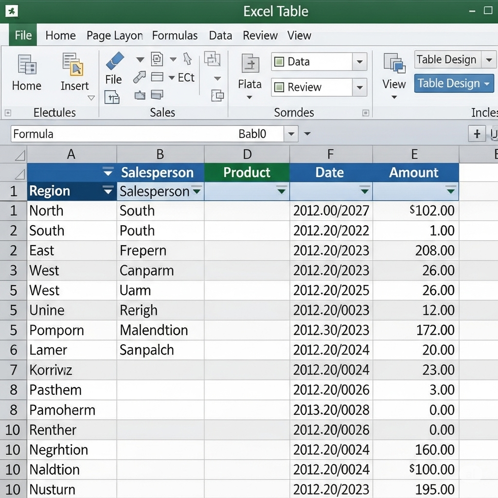
Converting your data range into a table offers several advantages:
-
Easy sorting and filtering
-
Automatic formatting
-
Dynamic range expansion when new data is added
Tables also make it easier to apply formulas and create structured references.
5. Sparklines
Sparklines are miniature charts placed inside cells to show trends in a small space. You can create:
-
Line sparklines
-
Column sparklines
-
Win/Loss sparklines
They are perfect for dashboards or quick overviews where space is limited.

Step-by-Step Example: Analyzing Sales Data with Quick Analysis
Let’s walk through a practical example:
-
Select Your Sales Data
Highlight the table with columns for months and sales figures. -
Open Quick Analysis
Click the icon or press Ctrl + Q. -
Apply Conditional Formatting
Use color scales to highlight months with the highest sales. -
Insert a Chart
Switch to the Charts tab and select a column chart to visualize sales trends. -
Calculate Totals
Use the Totals tab to find the total sales for the year. -
Add Sparklines
In the Sparklines tab, choose line sparklines to show monthly sales trends alongside each row.
In just a few clicks, you’ve transformed raw data into a clear, visual, and informative summary.

Tips for Maximizing the Quick Analysis Tool
-
Use Clean Data
Ensure your data is organized in rows and columns without blank headings. -
Experiment with Options
Don’t hesitate to try different formatting and chart types—Excel previews changes before applying them. -
Combine with Other Tools
After applying Quick Analysis, you can further customize charts, tables, or formatting for deeper insights. -
Use Keyboard Shortcuts
Press Ctrl + Q to access the tool quickly without touching the mouse.
Common Issues and How to Fix Them
Quick Analysis Tool Not Showing
-
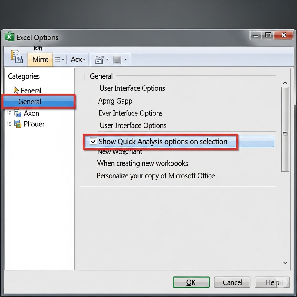
Ensure the feature is enabled:
-
Go to File > Options > General.
-
Check Show Quick Analysis options on selection.
-
-
Make sure you’ve selected a valid range with data.
Incorrect Chart Suggestions
-
Verify that your data is properly formatted and free from mixed data types.
-
Remove blank rows or irrelevant columns.
Benefits of Using the Quick Analysis Tool
-
Saves Time: Eliminates the need to search for tools in menus.
-
Encourages Visualization: Provides quick chart suggestions.
-
Reduces Errors: Applies predefined formulas and formatting correctly.
-
Boosts Productivity: Makes analysis accessible even to beginners.
Final Thoughts
The Excel Quick Analysis Tool is a game-changer for anyone working with data. It bridges the gap between raw numbers and meaningful insights, offering instant access to Excel’s most powerful features in a single click. Whether you’re preparing a business report, analyzing sales performance, or exploring data trends, this tool can save you time and effort while improving the clarity of your results.
By incorporating the Quick Analysis Tool into your workflow, you can focus more on decision-making and less on manual formatting or calculations. The next time you select a dataset in Excel, remember to click that small icon—you might be surprised at how much time you save.
