Adding Standard Deviation Error Bars in Excel: A Step-by-Step Guide
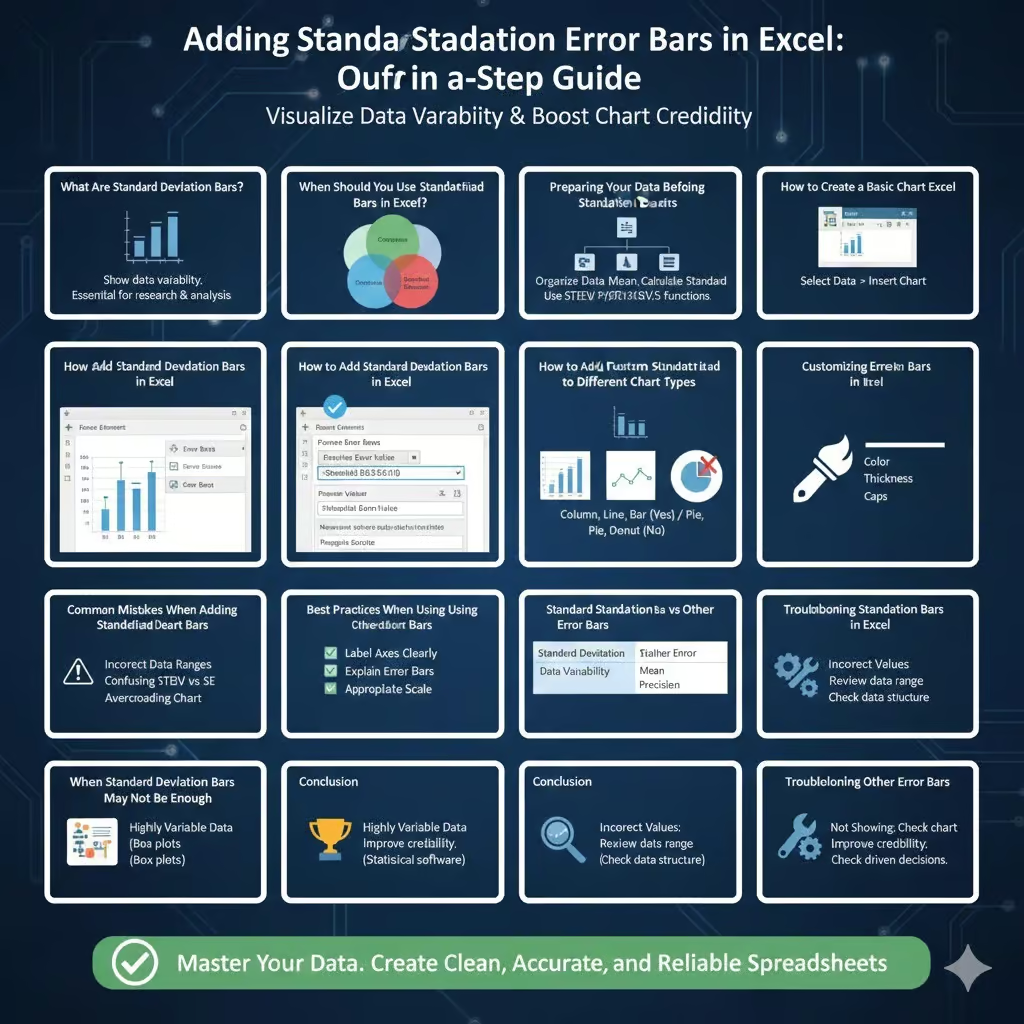
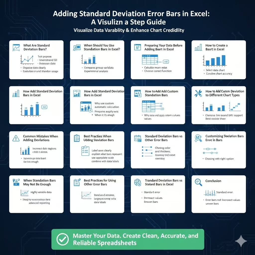
Standard deviation bars, also known as error bars, are a powerful way to visualize data variability in Excel charts. They help readers understand how much the data varies from the average, making charts more informative and statistically meaningful. Whether you are working on academic research, business reports, scientific experiments, or financial analysis, adding standard deviation bars can significantly improve the clarity and credibility of your charts.
This guide explains what standard deviation bars are, when to use them, and how to add them in Excel step by step. It also covers common mistakes, customization tips, and best practices to ensure your charts communicate data accurately.

What Are Standard Deviation Bars?
Standard deviation bars are graphical representations that show how much individual data points deviate from the mean.
Understanding Standard Deviation
Standard deviation measures the spread or dispersion of data around the average. A small standard deviation indicates data points are close to the mean, while a large one shows greater variability.
Why Use Standard Deviation Bars
They help viewers quickly assess data consistency, reliability, and variation across categories.

Where They Are Commonly Used
Standard deviation bars are widely used in scientific studies, laboratory results, quality control, finance, and performance analysis.
When Should You Use Standard Deviation Bars in Excel?
Standard deviation bars are not always necessary, but they are extremely useful in certain scenarios.
Comparing Group Variability
They show whether differences between groups are meaningful or within normal variation.
Presenting Experimental Data
They provide transparency about data reliability.
Supporting Statistical Analysis
They help visually reinforce numerical conclusions.
Preparing Your Data Before Adding Standard Deviation Bars
Proper data preparation is essential for accurate results.
Organize Data Clearly
Ensure your data is structured in columns or rows with clear labels.
Calculate the Mean
Excel charts typically plot averages when using standard deviation bars.
Calculate Standard Deviation
Use Excel’s built-in functions to calculate standard deviation for each data group.
Choose the Correct Function
Use population or sample standard deviation depending on your dataset.
How to Create a Basic Chart in Excel
Before adding standard deviation bars, you need a chart.
Select Your Data
Highlight the data range you want to visualize.
Insert a Chart
Choose an appropriate chart type such as column, bar, or line chart.
Confirm Chart Accuracy
Ensure the chart reflects the correct values and categories.
How to Add Standard Deviation Bars in Excel
Excel includes built-in options for adding standard deviation bars to charts.
Using Built-In Error Bar Options
Click on the chart, open chart elements, select error bars, and choose standard deviation.
What Excel Does Automatically
Excel calculates standard deviation based on the plotted data.
When Built-In Options Are Enough
This method works well for simple datasets with uniform structure.
How to Add Custom Standard Deviation Bars
Sometimes you need more control over error bars.
Why Use Custom Error Bars
Custom values allow precise control over upper and lower deviation ranges.
Preparing Custom Values
Calculate standard deviation values separately in your worksheet.
Applying Custom Values
Assign specific cells for positive and negative error values.
Best Use Cases
Custom bars are ideal for complex datasets or pre-calculated statistics.
How to Add Standard Deviation Bars to Different Chart Types
Standard deviation bars work best with certain chart types.
Column Charts
Commonly used for comparing categories with variability.
Line Charts
Useful for showing trends and variation over time.
Bar Charts
Ideal for horizontal comparisons with error indicators.
Charts That Do Not Support Error Bars
Pie charts and some specialty charts do not support standard deviation bars.
Customizing Standard Deviation Bars
Customization improves readability and visual appeal.
Changing Bar Color
Adjust colors to contrast clearly with the chart.
Adjusting Line Thickness
Thicker lines improve visibility in presentations.
Adding Caps
Caps at the end of error bars improve clarity.
Consistency Across Charts
Use the same style for all charts in a report.
Common Mistakes When Adding Standard Deviation Bars
Avoiding mistakes ensures accurate data presentation.
Using Incorrect Data Ranges
Assigning the wrong cells can misrepresent variability.
Confusing Standard Deviation with Standard Error
These are different statistical measures and should not be used interchangeably.
Overcrowding the Chart
Too many error bars can make charts difficult to read.
Ignoring Data Context
Standard deviation bars should support, not replace, numerical analysis.
Best Practices for Using Standard Deviation Bars
Following best practices improves data interpretation.
Label Axes Clearly
Ensure viewers understand what the chart represents.
Explain What Error Bars Represent
Always clarify whether bars represent standard deviation or another measure.
Use Appropriate Scale
Avoid misleading visual scaling that exaggerates or minimizes variation.
Combine with Data Labels When Necessary
This helps viewers understand exact values.
Standard Deviation Bars vs Other Error Bars
Excel offers multiple types of error bars.
Standard Deviation
Shows overall data variability.
Standard Error
Indicates precision of the mean estimate.
Percentage Error Bars
Used when variability is relative to the value.
Choosing the Right Option
Select the error type based on your analytical goal.
Troubleshooting Standard Deviation Bars in Excel
Sometimes error bars may not appear correctly.
Error Bars Not Showing
Ensure the chart type supports error bars.
Incorrect Error Bar Values
Double-check assigned cell ranges.
Bars Appear Uneven
Confirm consistent data structure and calculations.
When Standard Deviation Bars May Not Be Enough
In some cases, additional analysis is needed.
Highly Variable Data
Consider box plots for deeper insight.
Large Datasets
Statistical summaries may be more effective.
Advanced Reporting
Specialized statistical software may be required.
Conclusion
Adding standard deviation bars in Excel is a valuable technique for improving data visualization and communication. These bars provide insight into data variability, helping viewers understand not just averages but also the reliability and consistency of the data behind them.
By preparing your data correctly, choosing the right chart type, and applying standard deviation bars thoughtfully, you can create charts that are both visually clear and statistically meaningful. When used correctly, standard deviation bars enhance transparency, support data-driven decisions, and make Excel charts far more informative.

